

Energo
a powerbank renting app
About the client

Energo Moscow’s largest phone charging network, comprised of over 1,000 locations. It allows people who are out-and-about to charge up their devices on the go, without being tied to a specific location and without leaving their phone unattended.
Grab a power bank and take it with you anywhere you like.
I was brought on board to lead the effort of consolidating and improving the power bank rental experience between their Android and iOS apps

MY ROLE
TOOLS USED
PLATFORM
TIMELINE
-
User Experience
-
User Interface
-
Journey Mapping
-
Wireframing
-
Usability Testing
-
Interaction Design
-
Adobe XD
-
Origami
-
Flow
-
iOS
-
Android
-
6 months


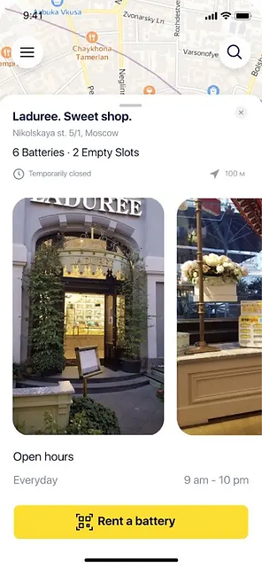
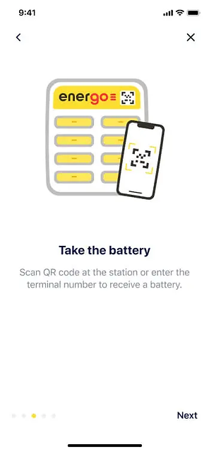
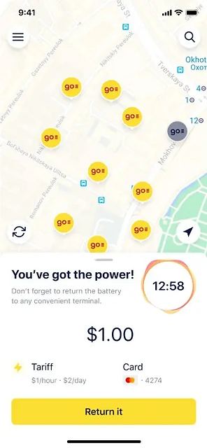

What's the challenge?
Consolidate in-app experience between Android and iOS.
Our main goal for this project was to redesign the app in a way that would provide a consistent user experience across Android and iOS for over 20,000 Monthly Active Users (MAU), while following Human Interaction Guidelines of each platform, and solving previously discovered interaction and accessibility issues.
Essentially, we wanted to:
-
Improve UI usability and accessibility
-
Lower barrier to entry for new and existing customers
-
Reduce app dwell time; maintain utility-first approach

My role
I led the redesign and consolidation of Energo’s mobile apps between January and November 2020; from initial review, feature ideas, concepts, user journeys, early prototypes, to the final UI design execution.
I worked alongside CEO, CTO, Head of Product, Head of Design, as well as iOS and Android Engineers.
The main bulk of work was completed in April 2020, while ongoing improvements and implementation guidance work was carried until November 2020, when the apps were released to the public.
APPROACH
The design process
Each problem requires an individual approach, however there are several tools that help ensure the consistency of results is maintained from project to project.
We’ve used the Double Diamond framework, which allowed us to quickly narrow down the scope of ideas without restricting ourselves as to what direction we wanted to take. The whole process for Energo's mobile apps looked something like this:
01
Discover
-
Field research analysis
-
“Service Safari”
-
Statistical evidence
03
Develop
-
Sketching / brainstorming (pen + paper)
-
Wireframing (pen + paper)
-
Visual design (Adobe XD)

02
Define
-
Journey mapping
-
“How Might We”
-
Priority mapping
-
Hypothesis
04
Deliver
-
Prototype
-
Test + Validate
UNDERSTAND
Systematise findings from user research and heuristic user interface review
Several weeks before I was hired, Energo commissioned field research which also delivered a concise evaluation of the overall rental experience, giving us a solid basis to start with.
While the research exposed aspects of the experience that needed attention it was not focusing specifically on the in-app experience. I decided that a separate evaluation of the existing apps is required before proceeding, followed by a peek inside the apps’ analytics to see the big picture.
Throughout the course of the project we worked in weekly sprints. We reviewed progress regularly in Zoom sessions involving stakeholders at each point. I used existing evidence from prior research, analytics, as well as ad-hoc usability observations to help us better understand the why’s, how’s, and when’s of people using Energo's apps.
DISCOVERY 01
Edge cases guide design towards a better experience
We tested the existing Energo app with a few participants. Our goal was to understand what issues our customers were facing. Our top findings were
Participants and Target audience
Gender
Female, Male
User Experience
> 10 years
Geography
Major cities
Age
20 - 35
Online Experience
> 5 years

01
Low battery gets people anxious
People were more frustrated with specific elements of the rental journey when their phone was running low on battery. They expected Energo rental to be quick and painless.
02
Poor coverage at rental locations
Customers expect a power bank rental experience that will work when the coverage is poor, network latency high and there’s a greater chance of communication issues.
03
Ineffective information architecture
Often, people had trouble with completing certain tasks within the UI on Android devices due to the inconsistent interactions and poor navigation in the app. They expected a more cohesive experience that supports their goals.
04
Looking for station ≠ being next to one
Energo customers use the app in two distinct ways. There are those who are looking for the nearest charging station and those who are already in front of one and want to rent a power bank right now.
DISCOVERY 02
A utility-like service
The research revealed how much reliant people are on power banks and portable device charging as a whole. They treat it more like a utility service rather than a convenient option, essentially making Energo a “portable energy supplier.”
If users with great mobile coverage, powerful modern phones and tech literacy were having issues with renting a power bank through the app, then what about the people who use technology as a means to an end, with slower devices, smaller screen sizes and worse eyesight?
It became apparent that a mere fresh coat of paint would be a waste of everyone’s time and money so we agreed on taking a deeper dive into the app’s user experience from the start
DISCOVERY 03
Power bank rental experience for everyone
From the beginning there were three major questions I kept asking myself and the rest of the team. Those questions formed the basis of my whole design strategy.
-
How do you design a consistent experience for two different mobile platforms?
-
What contexts need to be considered?
-
What does a perfect power bank rental look like?
It was clear we had to redesign both iOS and Android from the ground up. The former was not exactly on brand and had some usability issues, while the latter was just about usable due to the overall architecture of the app.
DISCOVERY 04
A more inclusive experience
The existing apps had just acceptable experience even for users who were familiar with their mobile platform of choice (iOS or Android). The inconsistencies in visual presentation and interactivity led to user errors and increased dwell time that could have been avoided.
To abandon the existing biases, I worked with the Head of Product to educate the team on the importance of designing for everyone, regardless of their current situation, which creates a specific context that can affect the way customers interact with Energo for a short period of time.
We stressed how important it is to treat the app’s interface as an enabler rather than a simple means-to-an-end, and ensure the core tasks can be accomplished with ease, regardless of the situation. It was not a hard sell once people started seeing the subsequent results of implementing good design.
The first step to finding out what is the perfect rental experience, was to break it down into predictable steps and ask ourselves what does each step needs to facilitate.
DISCOVERY 05
Isolating individual problems
To make sure this is not just a typical fashion-led redesign, we had to get to the bottom of some core issues. However, we could not tackle them all at the same time. Instead, we isolated a few problems that based on insights from analytics and customer support feedback were the most important to our audience.
-
How might we help people find a charging station?
-
How might we facilitate rental that reduces effort and saves time?
-
How might we help people better understand what they are paying for?
These questions would help us formulate specific problem hypothesis later on.
DEFINE
Core design principles
To bring order to chaos, we needed to make sure our intentions were aligned with our principles. As there was only a vague notion of what our design principles should be, I spent some time interviewing the team about their idea of what “good design” is.
I have distilled those thoughts and ideas into five principles to guide the designs which I then proposed to the team. Our designs should be:
01
Focused
Customers often don’t have much time left before their phone goes out of juice. Think about what you want them to see or do first.
02
Predictable
People should be able to accomplish their tasks with confidence, having a good sense of what may happen next. A button label should indicate intent.
03
Resilient
People who rely on power banks are often distracted, anxious, in a rush. Aim for clarity of each message, minimal interruption, and ability to recover from issues.
04
Familiar
Design with a sense of familiarity, using our brand as a means to connect the experiences together without making them inconsistent with the target platform.
05
Delightful
Interactions can offer more than just a sense of utility. Aim to delight the user, but never at the expense of their experience.
PROBLEM 01
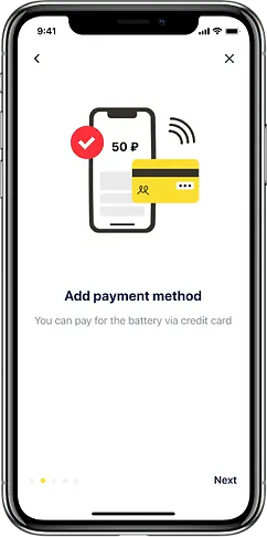
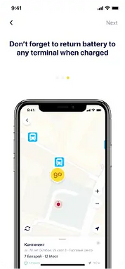
Onboarding experience

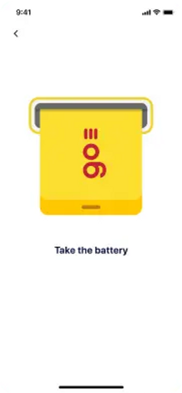
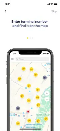
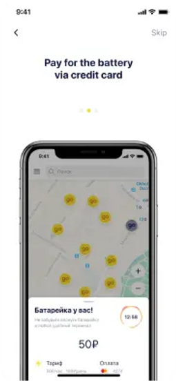
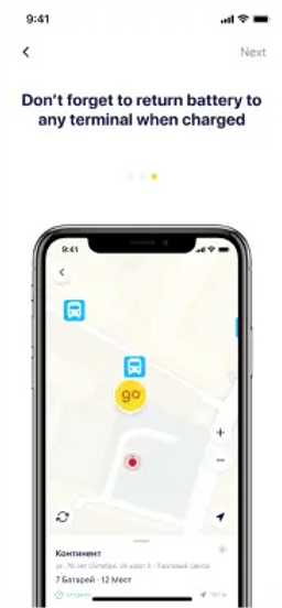
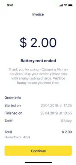
The app wasn’t exactly doing a swell job helping people get to know the service beyond displaying three vague introduction screens upon the first-time launch of the app.
It was more of a “figure it out, eventually” type of experience, and even though the idea of renting a power bank was relatively simple, we still wanted to make sure people get the most out of it, due to the amount of nuance.
A great deal of mobile onboarding experiences follow a familiar formula: show a couple of intro screens to swipe between when people launch the app for the first time, and… that’s it. Energo wasn’t any different. While better than no onboarding at all, it was not enough to reduce the anxiety while people kept wondering what will happen after they tap “confirm rental”.
Together with the Head of Product, we decided to rewrite the content for the intro screens, and after some deliberation I suggested to create a first-time guided experience that would not get in the way of the main order of business for the users.
With infrequent reminders and tidbits of information scattered around crucial places within the UI, we made sure the Customer Support team would be busy helping people solve only the biggest of issues.
PROBLEM 02
App navigation
From the guerrilla usability research we’ve done and the data from app analytics it was clear people were thrown off by things such as:
-
How much do I have to pay?
-
How do I return a power bank?
-
How do I see my rental history?
These were just some of the questions that Energo customer service team was reporting over the last few months on and on.
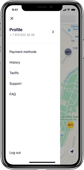
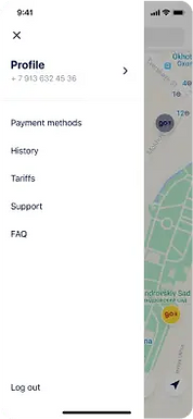
To help with this, I evaluated the current app structure and realised that the vast majority of screens were hidden deep beyound the main menu under the "profile" and "settings" screens. Everything was there: from rental history, through settings, to support links, however it was hard to find.
Instead of redesigning it straight away, I took time to evaluate the app’s information architecture and its navigation structure by using card sorting technique. The result of this exercise was a clearer navigation structure, thematically grouped sections and simplified options that were brought forward to the main menu.
The options were now always accessible, and this itself reduced dwell time and cognitive load on people trying to add a new payment option, contact customer support or see their rental history.
PROBLEM 03
Lowering the barrier to entry
As most startups, Energo faces a common problem: the barrier to entry. Their service requires people to sign in before they can rent a power bank or get on the line with Customer Support, which can put some people off.
They’ve already implemented the use of One-Time Passcodes (OTP), so an initially high barrier to entry was lowered significantly compared to conventional email and password combination. It only required the user to enter a four-digit code sent to them by SMS.
However, we were still seeing approx 50% dropout rate for first-time users, so something was clearly not up to scratch. Using heuristics, we quickly found out that the process requires people to switch between “registration” and “sign-in” modes. As discovered by NNGroup during usability studies, modes aren’t all that useful in contexts where there are not so many different options available to the user.
Modes become useful when we have too many different options that we want to make available to users, and not enough available types of input to accommodate them all (in a usable, discoverable, and sensible way). —NNGroup, “Modes in User Interfaces”
The alternative was to move the registration till after the initial rental was confirmed. However, this would require a lot of reengineering of the code in both clients and in the API, so we wanted to avoid doing it, unless absolutely necessary.
After some brainstorming, I suggested that we could maybe detect whether a user’s phone number is stored in the database and based on that either proceed to the OTP entry straight away (for existing customers), or ask for their full name (if it’s a new customer), doing away with the whole idea of “registering an account” altogether.
It turned out that was very easy to implement using existing API endpoints and so the solution was incorporated into my designs.
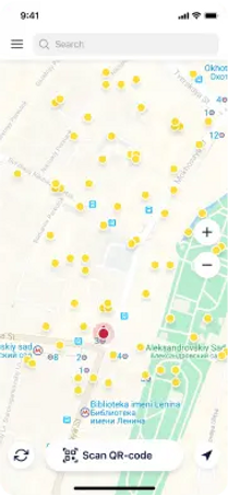
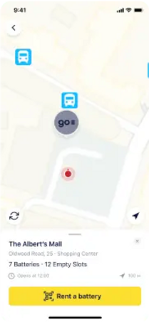
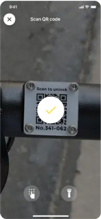
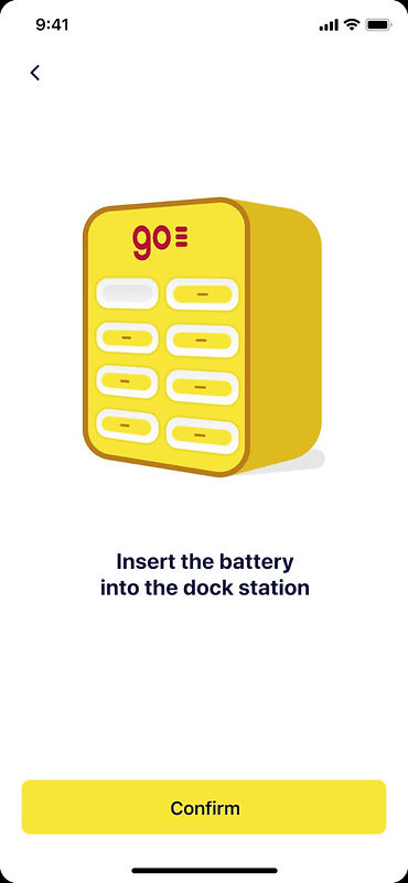
The first step to renting a power bank is to actually pick a station you want to rent it from by scanning a QR code or entering a number displayed on the front of it. It may seem simple, but we observed that:
-
People picked a station that had no power banks in a “ready state” (with a 75% charge or more).
-
People assumed a charging station is always turned on, and always online (it depends on how venues manage them).
-
People assumed they entered the code correctly, ending up unlocking a power bank from the wrong station.
The lack of feedback from the app was killing the experience by increasing the anxiety in anticipation of releasing a battery from the charging station. People did get it wrong, quite frequently in fact, which was easily provable by examining the feedback Customer Support received and the amount of refunds issued for failed rentals.
While the second round of designs for the scan screens was nearly done, Energo CTO suggested that maybe we could use HTTP Status Codes coupled with Location Services to evaluate the responses and issue appropriate feedback to the user.
Based on this, we ideated a few core types of messages a user should see when the conditions aren’t ideal.
PROBLEM 04
Designing for failure

Station unresposive
Would you like to find another station nearby?
You can also ask venue staff to power - cycle the station
Find station
X

Distance to station
The station you picked seems to be a bit far from your current location. Are you sure you want to proceed?
Confirm
X

No charged batteries
Would you like to find another station with avavlable batteries nearby?
X
Find station
TAKEAWAYS
What I learned
01
Don’t reinvent the wheel
It’s easy to start designing custom UIs in the hope of “unifying the experience”. That’s not what I wanted to do with Energo. I wanted each app to retain its own platform’s tried and tested interaction patterns and align the vision with each platform’s principles.
By creating custom components only for things we could not get from Material Design (for Android) or UIKit (for iOS), I was able to simplify design and development of both apps.
02
Always aim for most accessible colour
Energo’s brand colour palette was not initially optimal for working with user interfaces. It took me a few solid days to experiment with colour and create a derivative palette that we were able to use with confidence, taking into account colour contrast on elements and in typography.
This is all-the-more important, given there are very few ways you can convey your brand within a mobile app, especially one which serves as a utility: functionality always comes first.
Colors

Typography
It was important to make all texts in the app legible — even if it’s run on a low-spec device. That’s why we used neutral SF Pro Text — a sans-serif typeface developed by Apple.

02
Great ideas come from everyone
Spending time within your own product bubble can be detrimental to the product itself, as you develop more and more biases. Talk to the people outside of your inner circle.
One of the most helpful ideas during this project came not from the product team which I was part of, but from Energo’s CTO, who offered an elegant and simple solution to a problem we would have likely overthought
RESULTS
Rebuilding apps from the ground up
The engineering team decided that the best course of action would be to throw away legacy code and start from scratch, not only due to the differences in the user experience, but most importantly due to the convoluted architecture of previous apps that were extensions of initial MVPs.
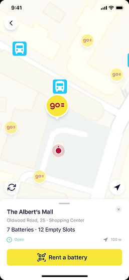
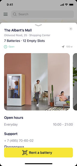
New Design screens
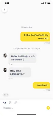
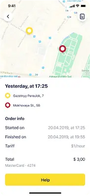
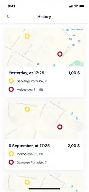
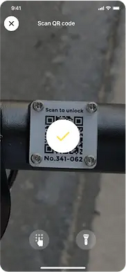
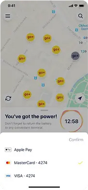
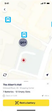
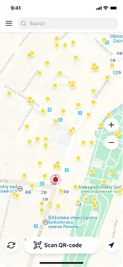
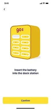
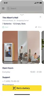
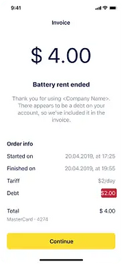
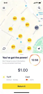
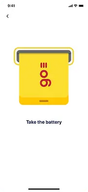
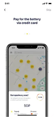

70+ screens

RESULTS
What exactly did we achieve with this project?

-
Reduced sign-in/registration drop-off by over 25%, confirming our hypothesis about streamlining the process.
-
Improved conversions by implementing updated service selection and checkout flow.
-
Reduced app dwell time by 60%;
-
Apps are now faster and more lightweight making them accessible to people with even tiny data plans and older devices.
You can find both Android and iOS apps on their respective app stores as of November 2020.
App Store & GooglePlay Preview


